MantelzorgNL:
Time Management Tool for Caregivers
(TIMELINE)
2024
(PROJECT TYPE)
UXUI
Prototyping
(COMPANY)
MantelzorgNL
(BACKGROUND)
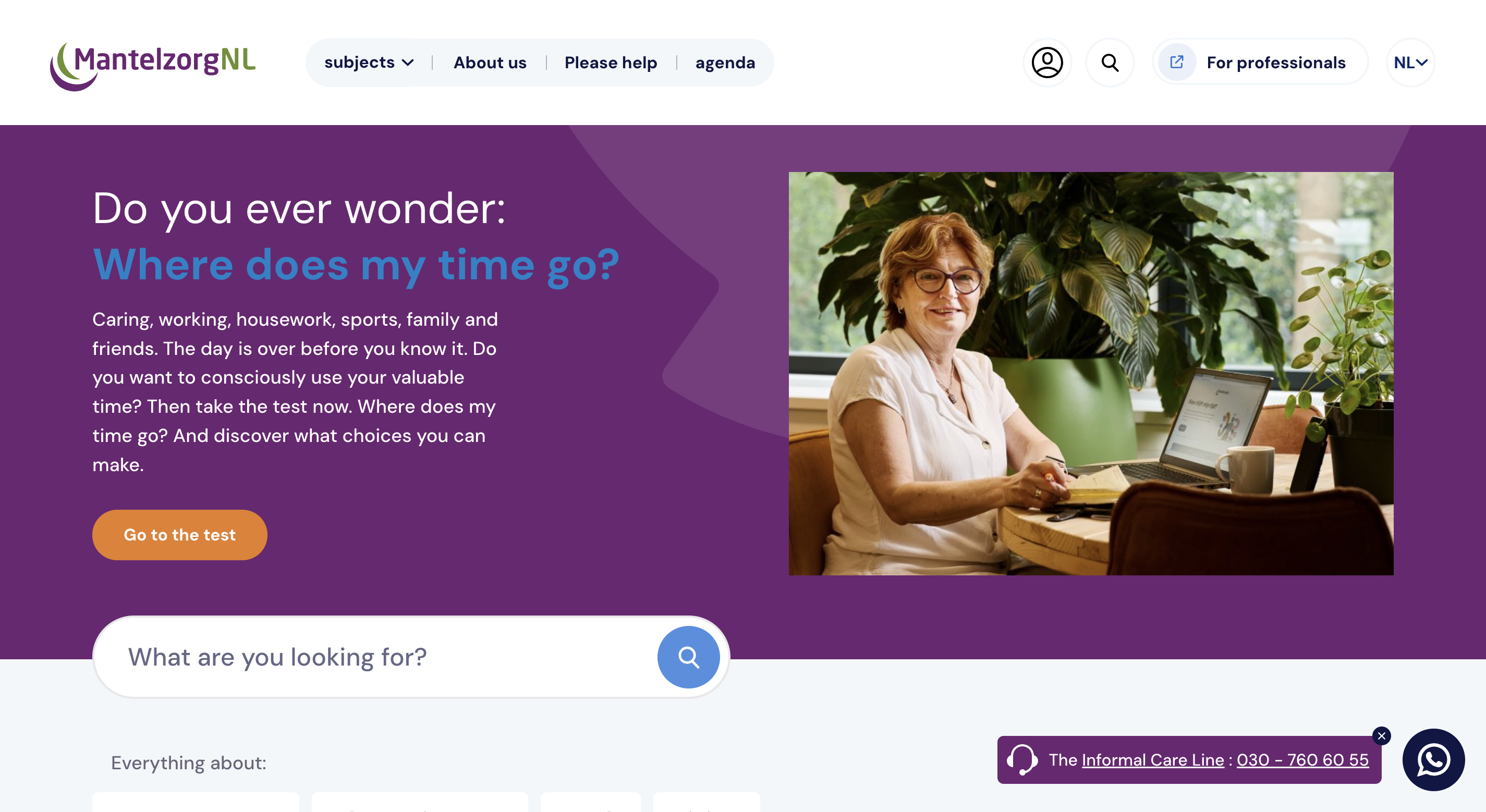
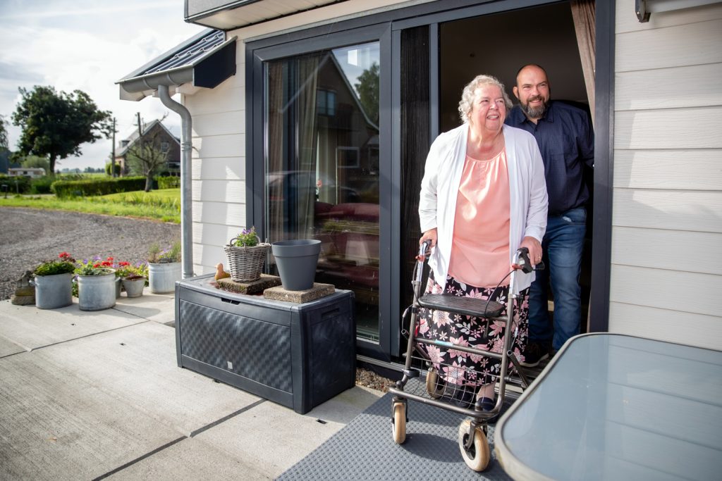
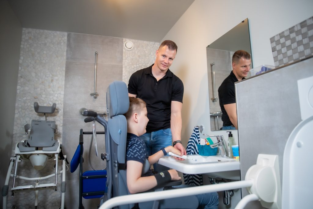
MantelzorgNL, a Dutch national association supporting informal caregivers (care for a loved one who is ill for a long time, has a disability or needs help), is leading the development of an online time management tool "Waar blijft mijn tijd". This tool, which started as a questionnaire, aims to empower informal caregiversby helping them manage their time better, set boundaries, and prioritize self-care. By offering a structured way to organize tasks, it fits into MantelzorgNL's vision of creating a society that supports informal caregiving. The tool helps informal caregivers balance their caregiving responsibilities with other aspects of their lives, promoting choice and ensuring caregivers receive the support they need.
(ROLE)
UX Research
Concept development
High-Fidelity Prototyping
UI Design
Branding
(TEAM)
Today Tomorrow
(work with creative director, project manager and developer)
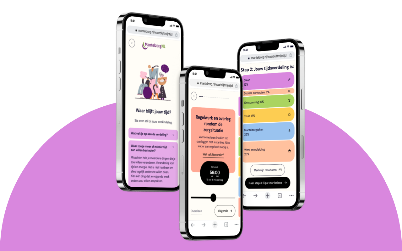
You can visit our site to discover the magic of our tool, or if you're curious about the design process, just scroll down. Instead of hidden treasure, you'll find all the juicy details!
The Development of MantelzorgNL's Online Time Management Tool for Caregivers
Recognizing the challenges of informal caregiving, MantelzorgNL saw the need for an accessible online time management tool. Originally in questionnaire form, they aim to broaden its reach, particularly for consultations. This tool empowers caregivers to manage their time, establish boundaries, and prioritize self-care.
It aligns with MantelzorgNL's vision of a supportive society for caregivers and their goals of promoting choice in caregiving and ensuring universal support. By offering a structured approach to organizing tasks, the tool aids caregivers in maintaining well-being while fulfilling their caregiving roles.

Aim of the Tool
1. Setting Boundaries as an Informal Caregiver:
- Recognize signs indicating you've reached your limit.
- Foster awareness to prevent burnout.
Understand various scenarios of caregiver overwhelm
Excessive responsibility, lack of support, time constraints, challenging behavior from the care recipient, mismatched tasks, high expectations- Identify boundaries that should or could be established.
- Acknowledge that healthy boundaries are flexible and can evolve over time.
- Assess your current well-being.
2. How to Establish Boundaries:
Explore why setting boundaries can be challenging (personal traits, sense of duty, reluctance to seek help, familial patterns, fear of conflict, guilt).
Promote reciprocity and appreciation within the caregiver relationship.
Assess your awareness of personal boundaries.
Address discomfort associated with boundary-setting (guilt, fear of judgment).
Develop strategies to manage difficult emotions, minimize discomfort, and prioritize self-care.
Prepare for conversations about boundaries with family, professionals, or others involved in caregiving.
3. Understanding Personal Preferences and Desired Changes
- Identify personal preferences and desires underlying boundary establishment.
- Explore what you enjoy about caregiving and areas where you seek improvement.
The Design Process
(01/ RESEARCH )
- Compare similar tools and find inpirations
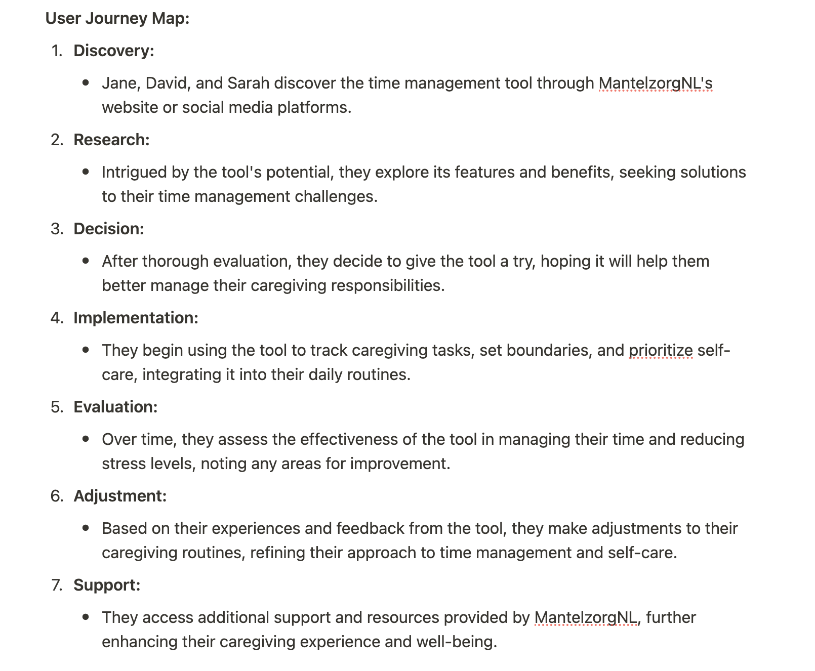
- User archetyes and user journey mapping
(02/ CONCEPTS AND IDEAS )
- Design UX flow for the whole tool
(03/ BRANDING AND VISUALS )
- Branding for the tool
- Testing out the styles and check which one fits the motif and the target group best
(04/ PROTOTYPING )
- Work with creative director, project manager and developer on QA
- Create low and high-fidelity prototypes
(01 / RESEARCH )
Initial User Research Summary
A diverse array of individuals grapple with the intricate task of balancing caregiving duties alongside other life commitments. Caregivers encompass a broad spectrum, ranging from family members to friends and neighbors, extending care to elderly individuals or those grappling with disabilities or chronic ailments.
Research findings underscore the pervasive challenges encountered by caregivers, marked by stress, burnout, and a pervasive sense of overwhelm attributed to the demanding nature of their responsibilities. Many struggle with effective time management, boundary setting, and prioritizing self-care amidst the juggling act of multiple obligations. Moreover, caregivers often encounter hurdles in accessing sufficient support and resources to aid them in their caregiving endeavors.

It's worth noting that MantelzorgNL's primary demographic typically comprises individuals in middle age, rather than younger caregivers.

User Archetypes
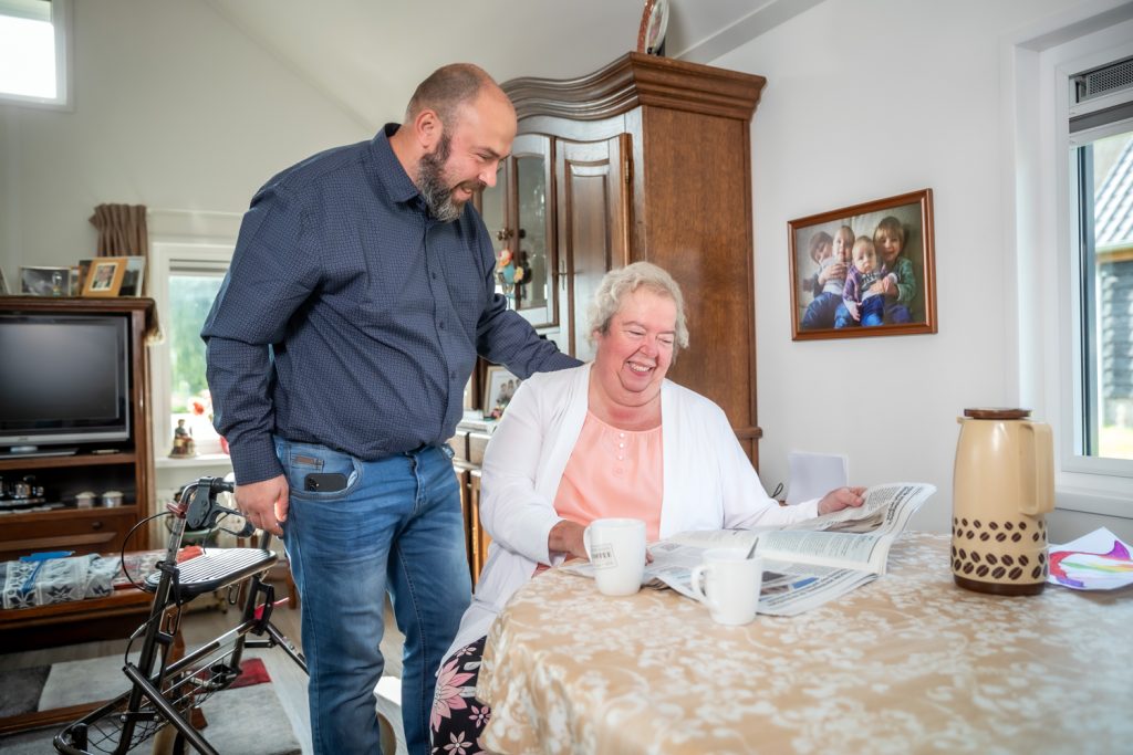
We gather some of the most common types of informal caregivers from the what MantelzorgNL usually encounters.
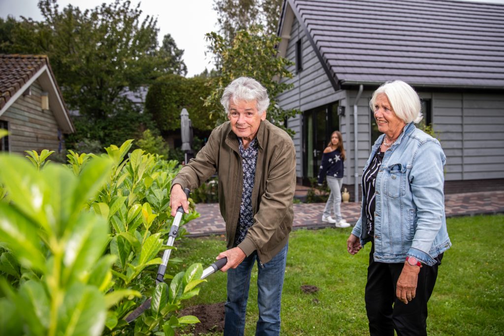
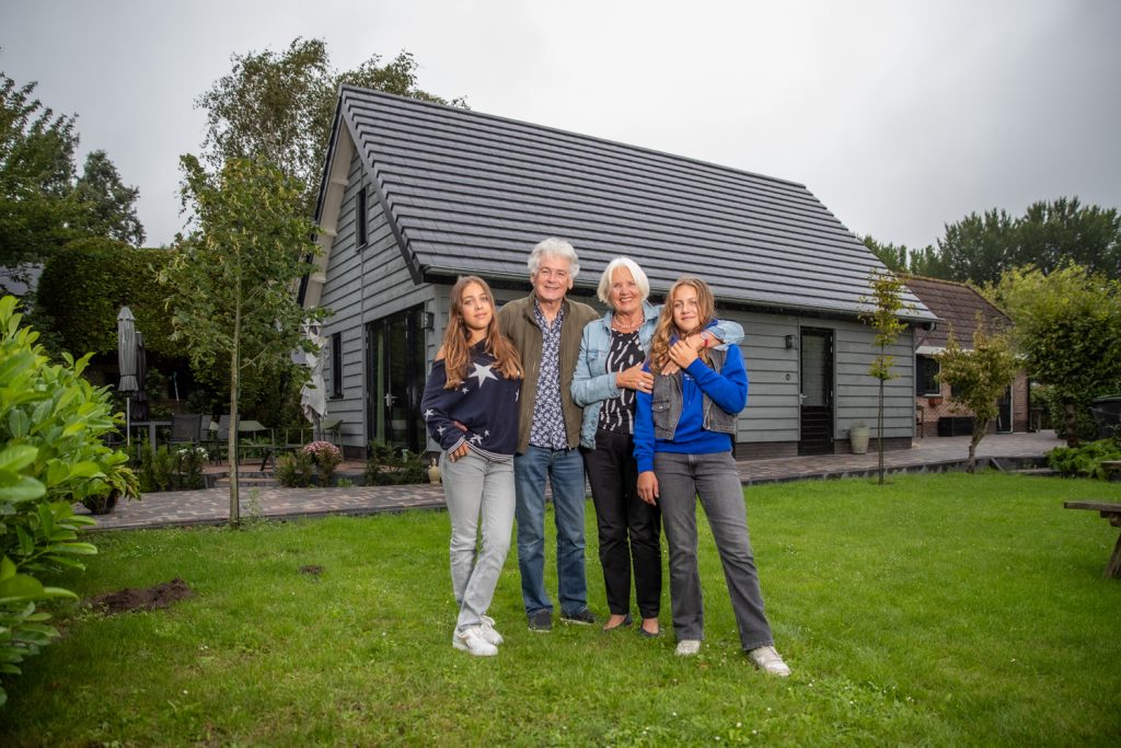
- Family members
- Friends
- Neighbor
User journey maps
I visualize all steps by gathering user archetypes on time and task reflection while using the tool.
(02/ CONCEPTS AND IDEAS )
Initial ideas for designing the tool
Due to the tight project timeline, we brainstormed several ideas. We need to select a method that allows for quick yet durable design development. Below are the initial concepts we considered, along with the reasons for their rejection:
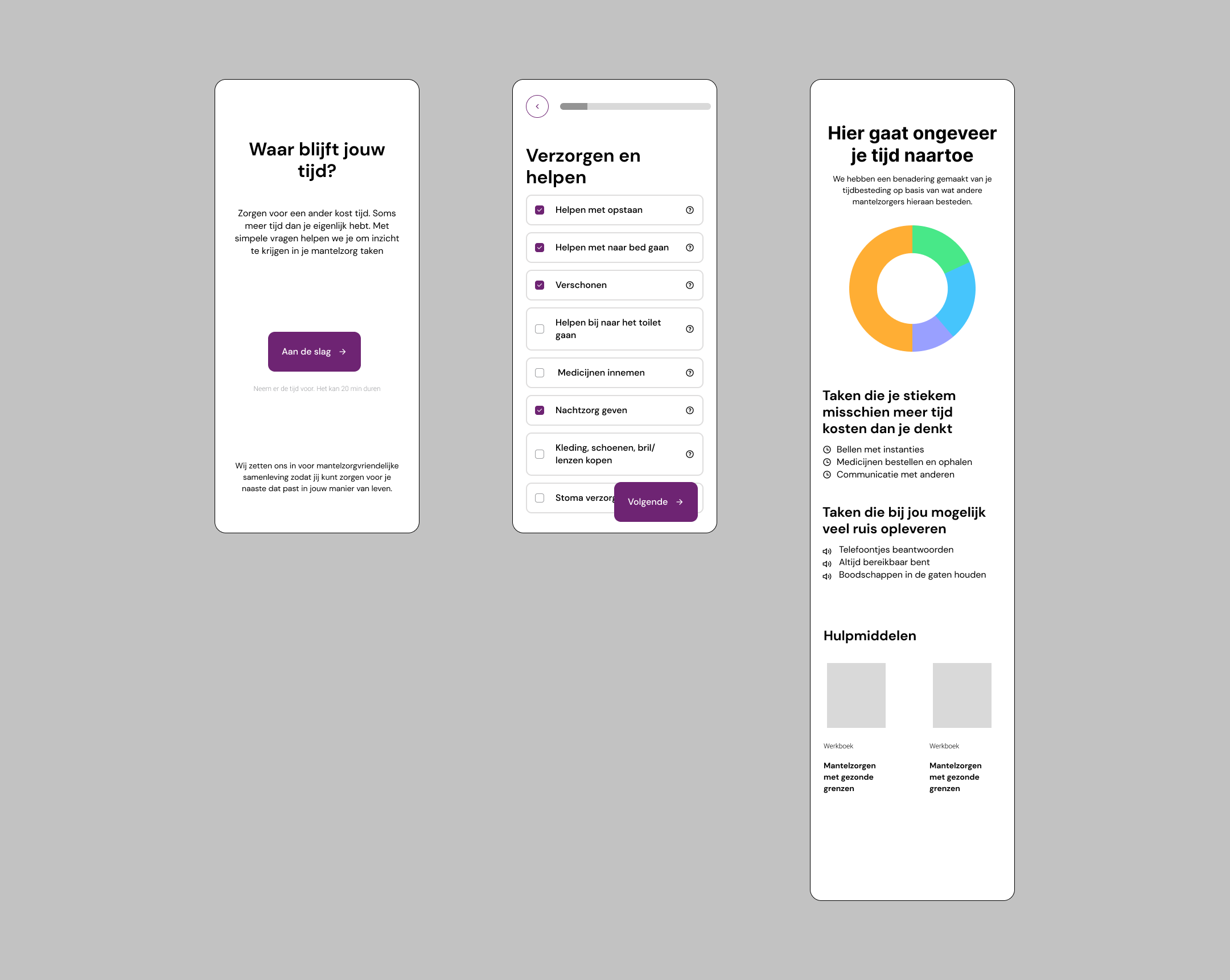
(IDEA 01)
Develop our own questionnaire
Rejected since it is time-consuming to develop
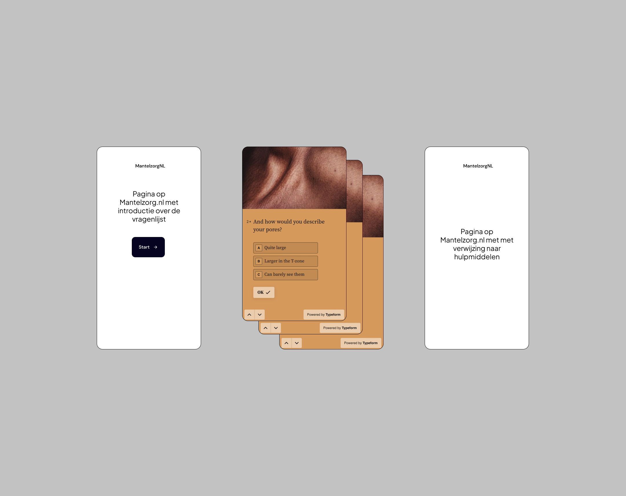
(IDEA 02)
Questionnaire built with Typeform
Easy to develop but lacks design uniqueness
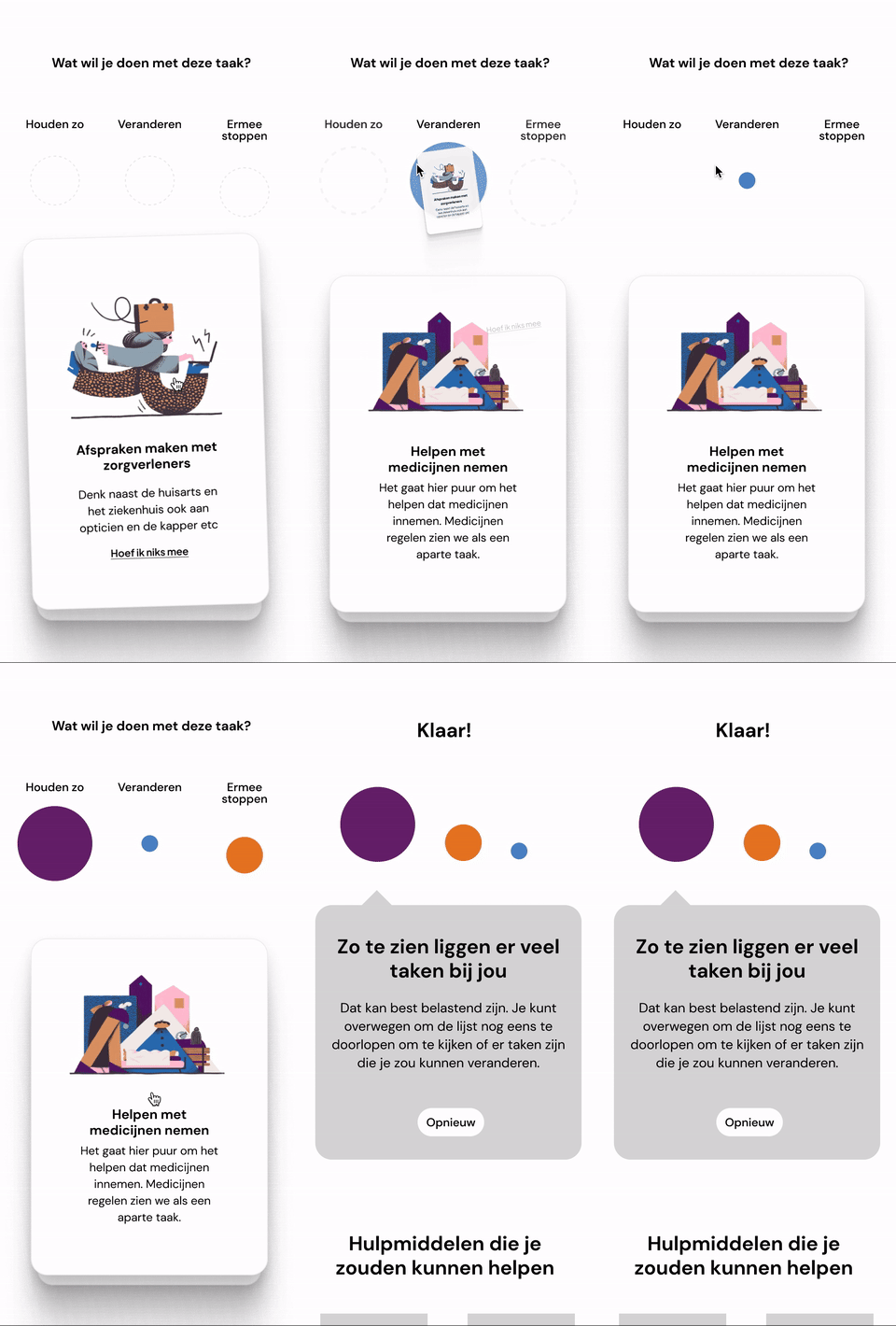
(IDEA 03)
Drag and drop card sorting game for caregiving tasks
Rejected due to an existing physical version from MantelzorgNL
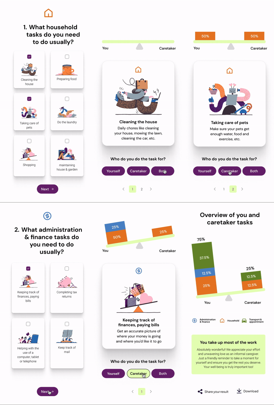
(IDEA 04)
A game designed to help caretakers and caregivers organize tasks, ensuring a balanced distribution of responsibilities.
Rejected due to complex logic and potential bias
Final Idea
We developed a new concept, a slider tool for users to input the time spent on specific tasks. This tool provides instant feedback with a time bar and allows users to review their weekly time allocation.

UX of the tool
The tool is designed to include four major backbones:
- Understanding your care tasks
- Providing a weekly overview of your time and tasks
- Reflecting on your time allocation
- Offering additional resources and assessments.
(03/ BRANDING AND VISUALS )
Exploring several styles with mockups & prototypes
We aim to create branding that brings more joy to users when interacting with the tool. We developed three different styles to choose from.
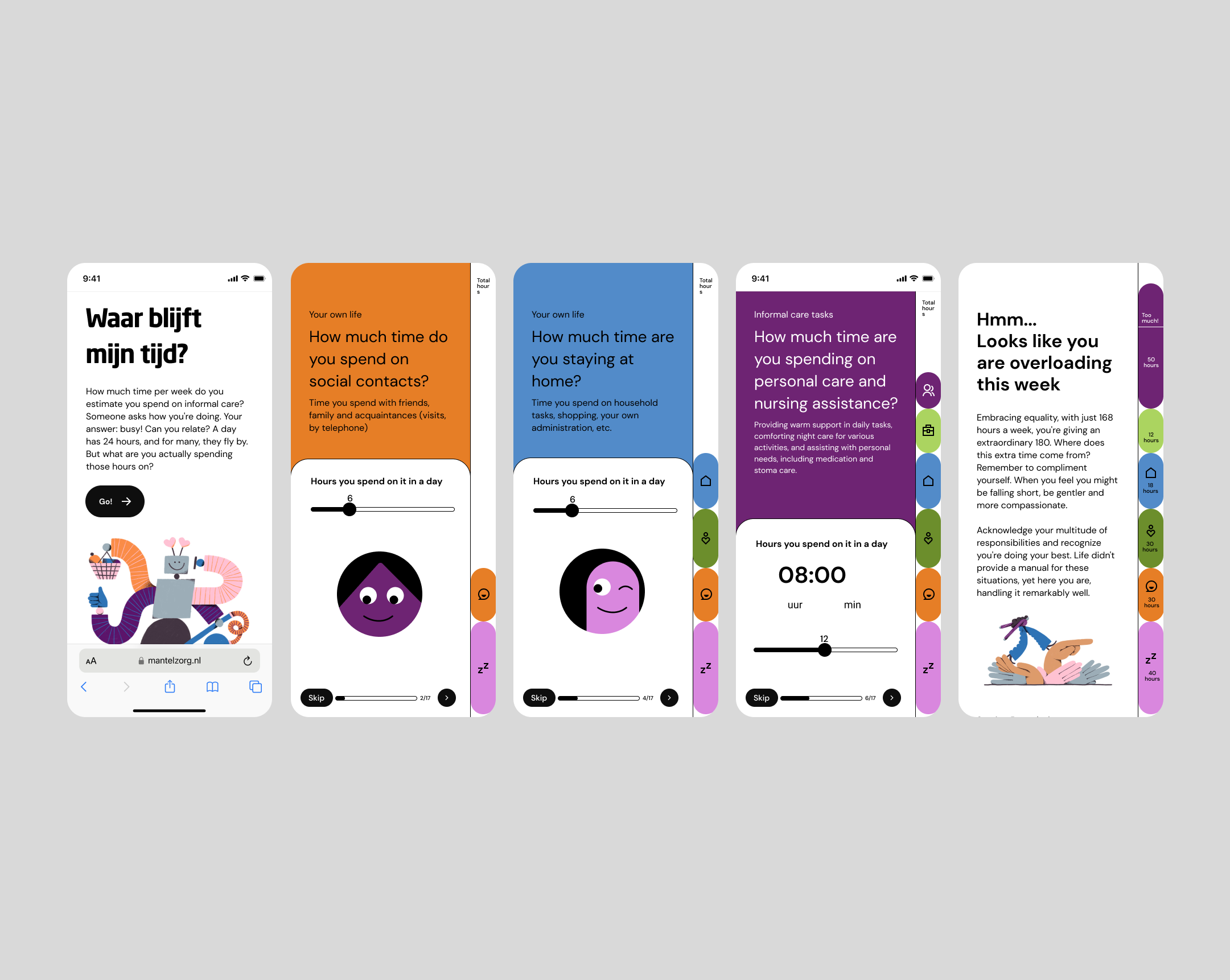
(STYLE 01)
Vibrant and playful
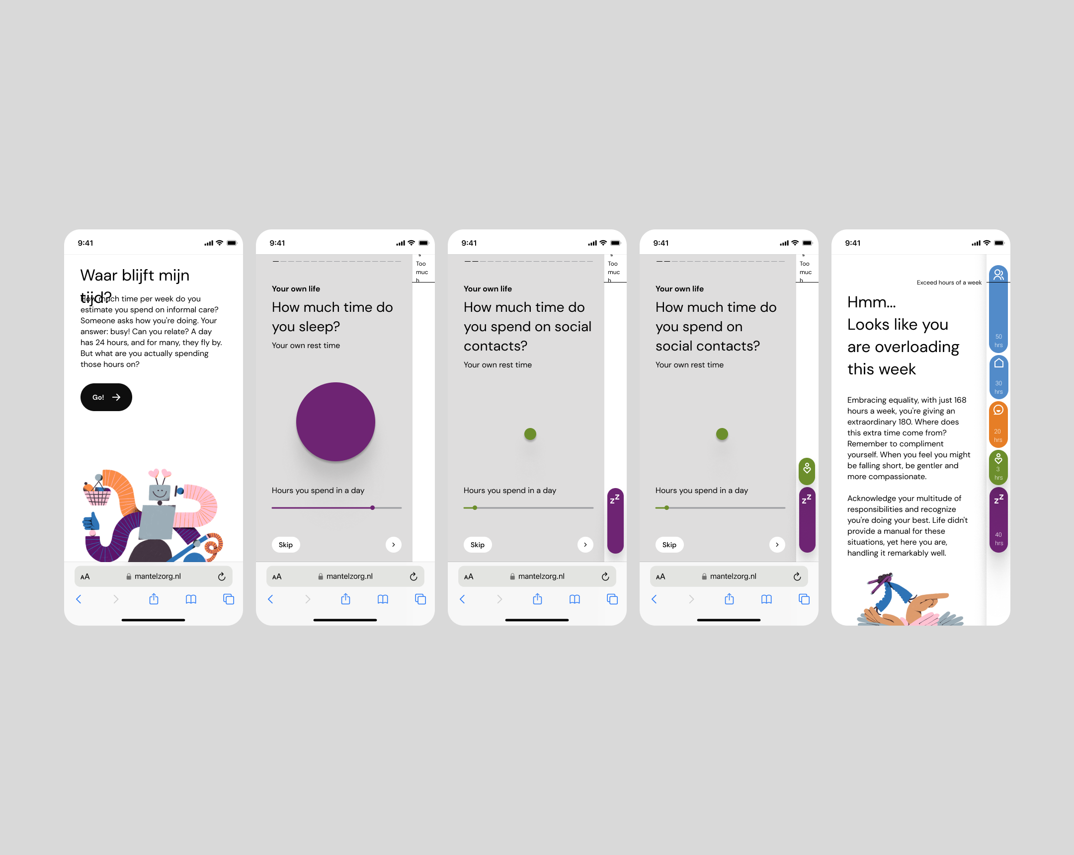
(STYLE 02)
Secure and conventional
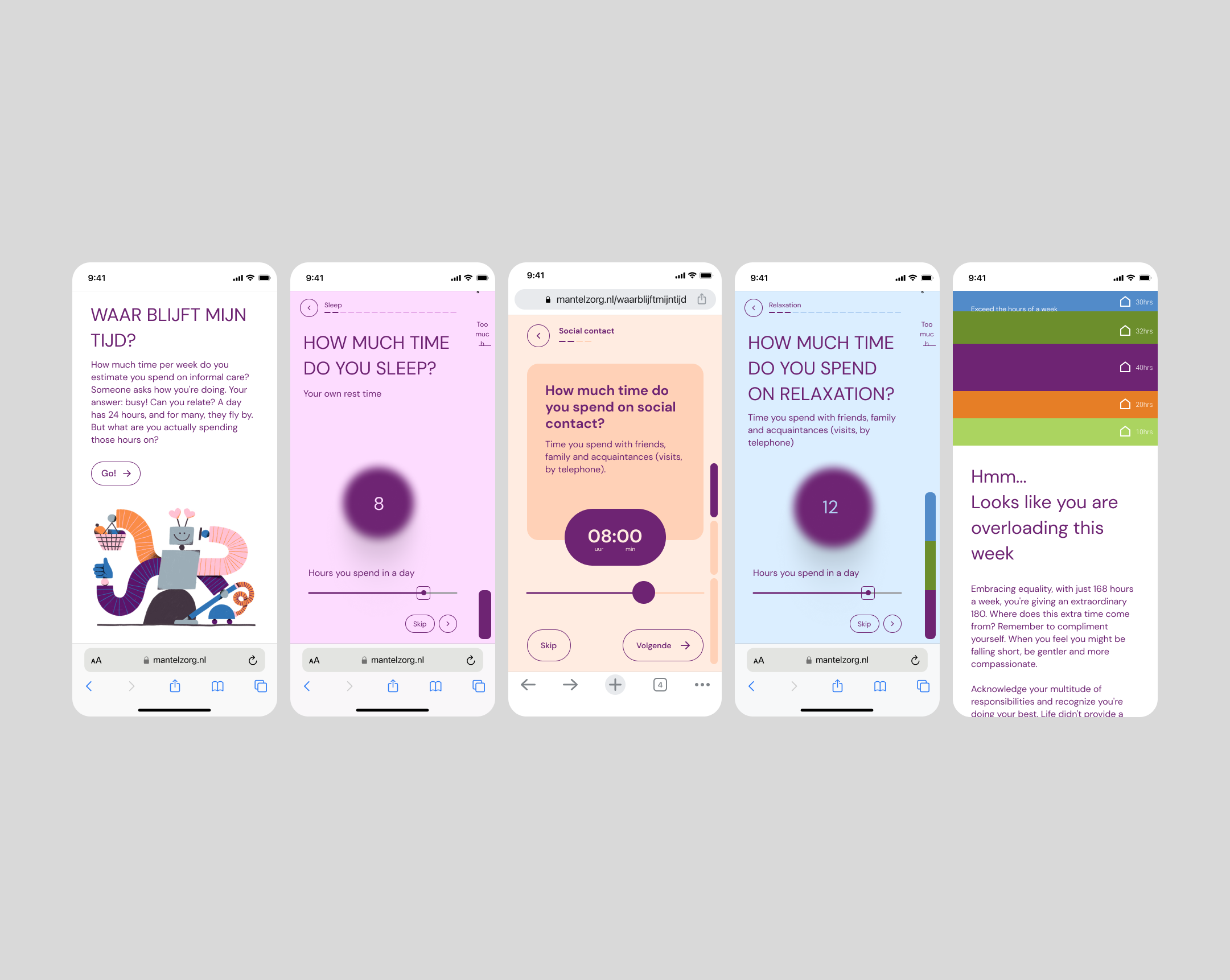
(STYLE 03)
Elegant and understated with refined design elements
Final Style
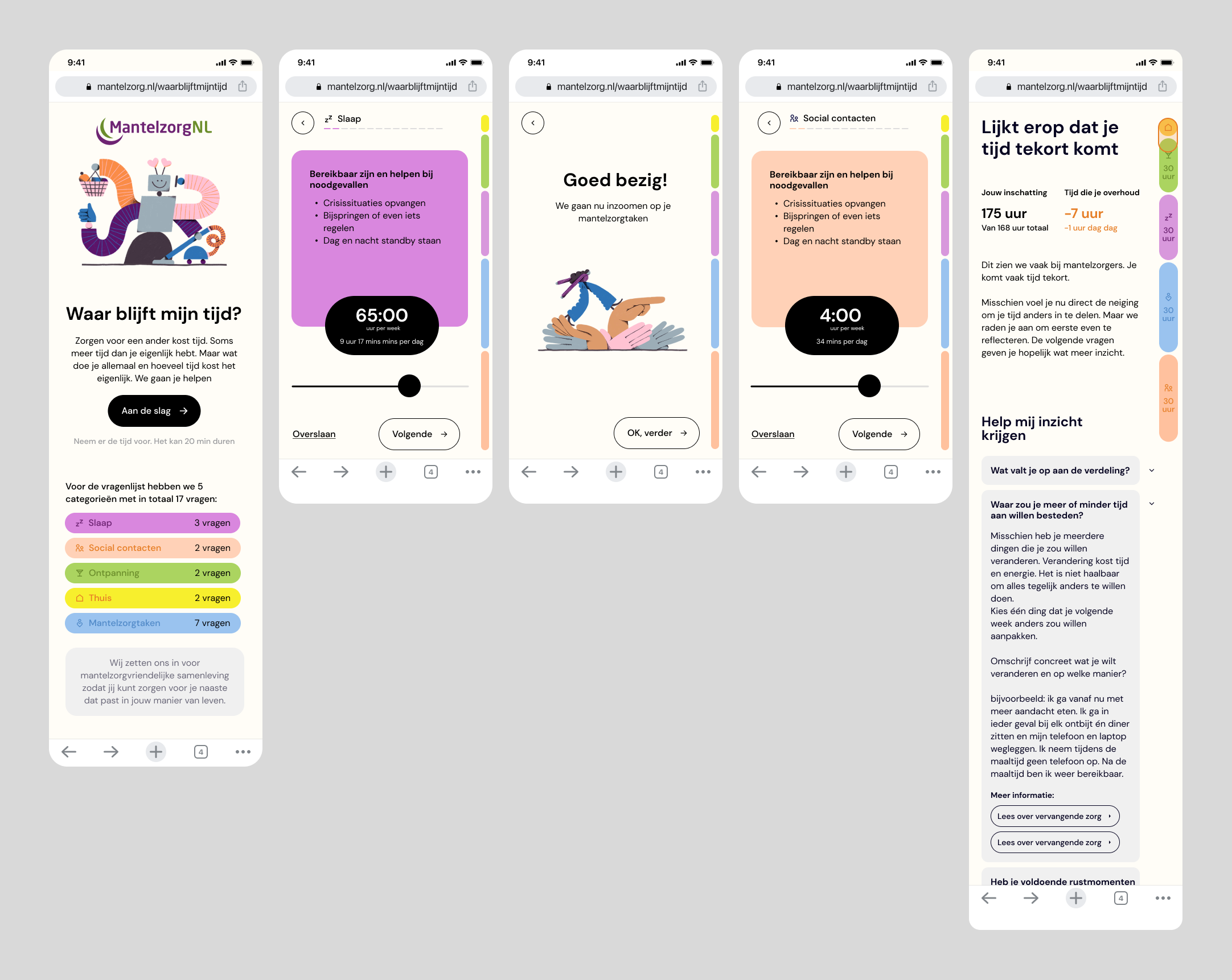
We chose a minimalistic approach by gathering some good aspects of each proposed styles to align with the preferences of our target users and clients, who favor a neutral and clean design.
(04/ PROTOTYPING)
Design Challenges
During the design process, we need to be mindful of several aspects.
(CHALLENGE 01)
Accessibility and Readability
Ensuring the tool is accessible for elderly users by designing it in Dutch and using suitable font sizes and color palettes that enhance readability without overwhelming the user.
(CHALLENGE 02)
User Engagement and Feedback
Creating an interactive and engaging experience by streamlining information to avoid overload and incorporating features that provide instant feedback on user behavior and lifestyle choices.
(CHALLANGE 03)
Practical Constraints
Addressing practical constraints such as tight development schedules and data storage limitations by planning efficiently and finding alternative approaches for data handling.
(CHALLANGE 04)
Task-Appropriate Design
Adapting features to fit the nature of Mantelzorg tasks, which often span over weeks, and ensuring the design remains simple for developers to implement while providing meaningful and actionable results for users.
(CHALLANGE 05)
Balancing Simplicity and Depth
Striking a balance between simplicity and complexity, ensuring the tool is easy to use without sacrificing the depth of reflection and maintaining consistency in its message and outcomes.

(CONCLUSION)
Final designs after usability testing
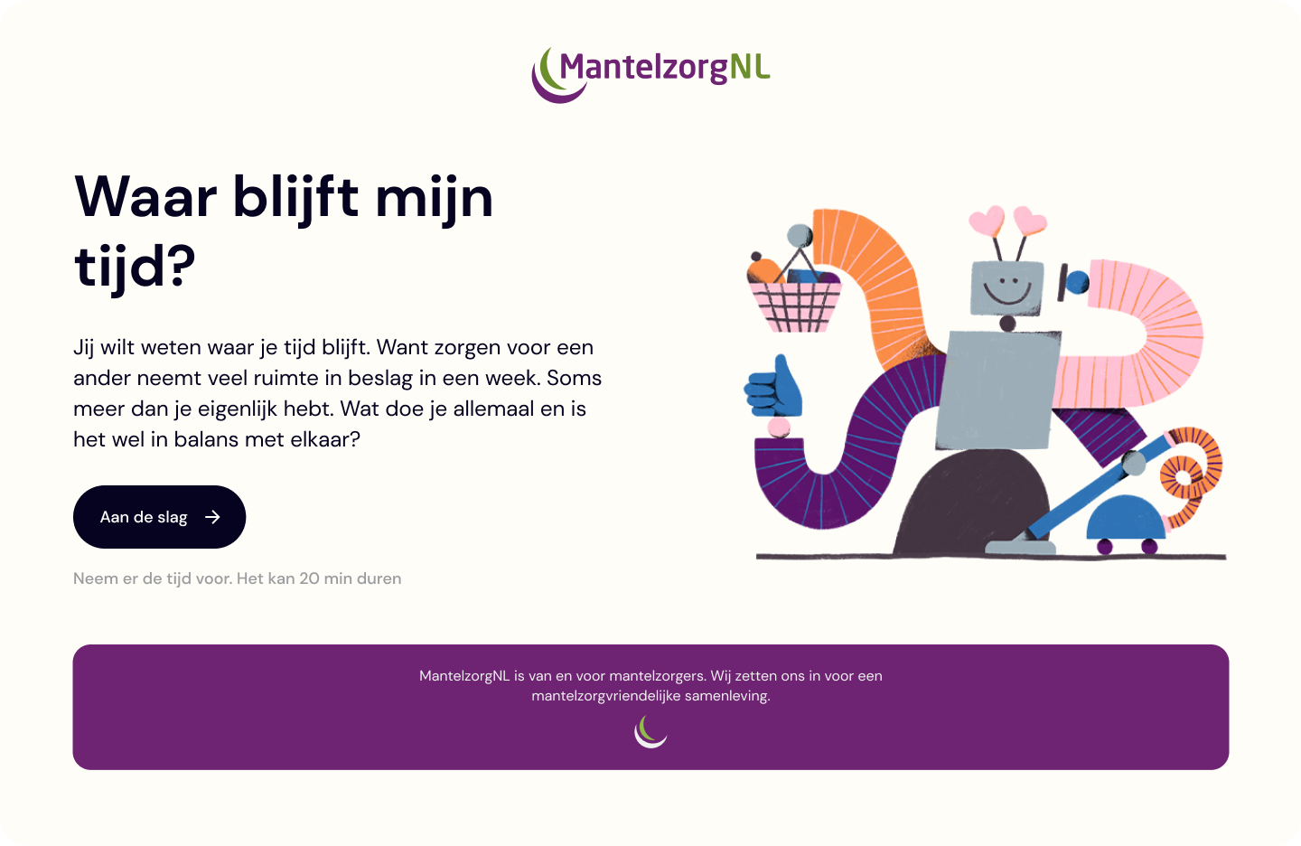
We refine the copy based on client-side user feedback, ensuring that the text matches the tool's context. We add remarks to clarify questions, as our primary aim is to help users accurately reflect their time.
Sneak peak of the website design
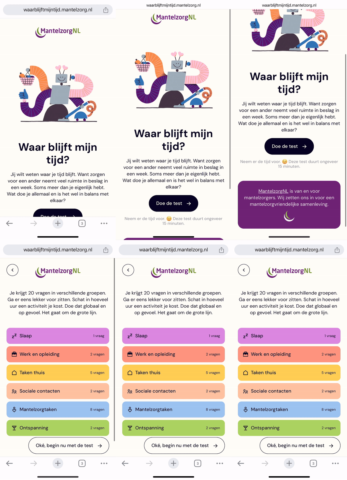
( 01 / INTRO OF THE TOOL)
Users can preview the categories of questions they need to answer before starting the questionnaire.
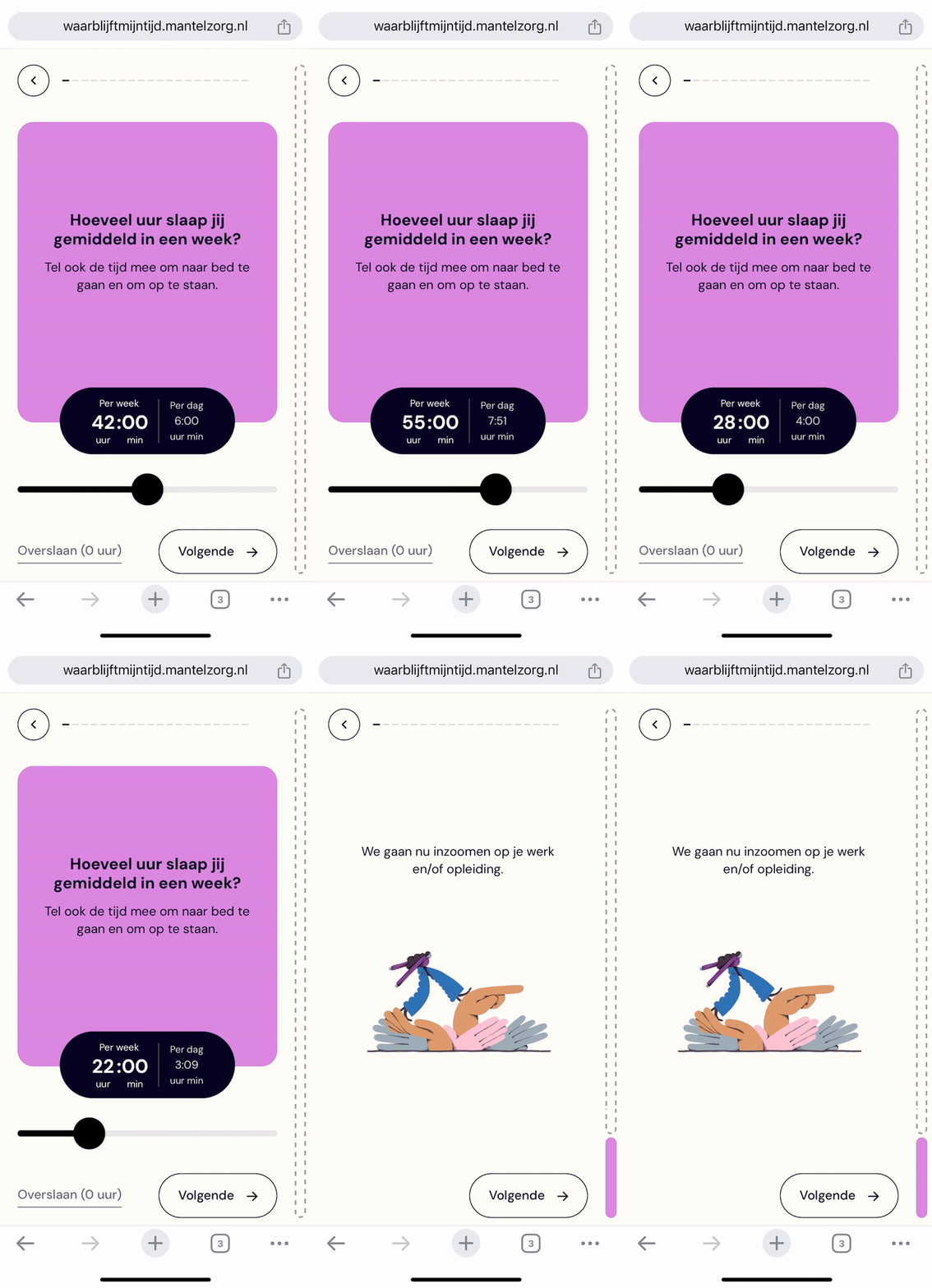
( 02 / TIME SLIDER)
For each question regarding the time spent on specific tasks, users can use a slider to indicate the time spent on that task each week or day. If no time was spent on a task, users can simply skip the question.
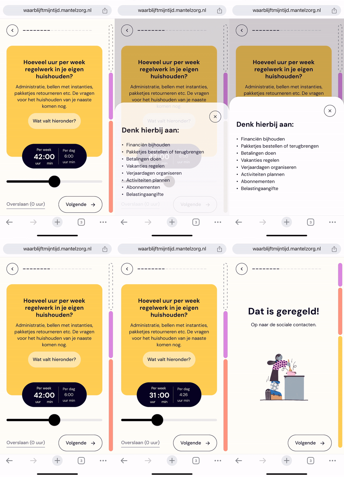
( 03 / TIME BAR)
Users can click to view additional information for each question. The time indicated in each category will appear in the right bar once all questions in that category are completed.
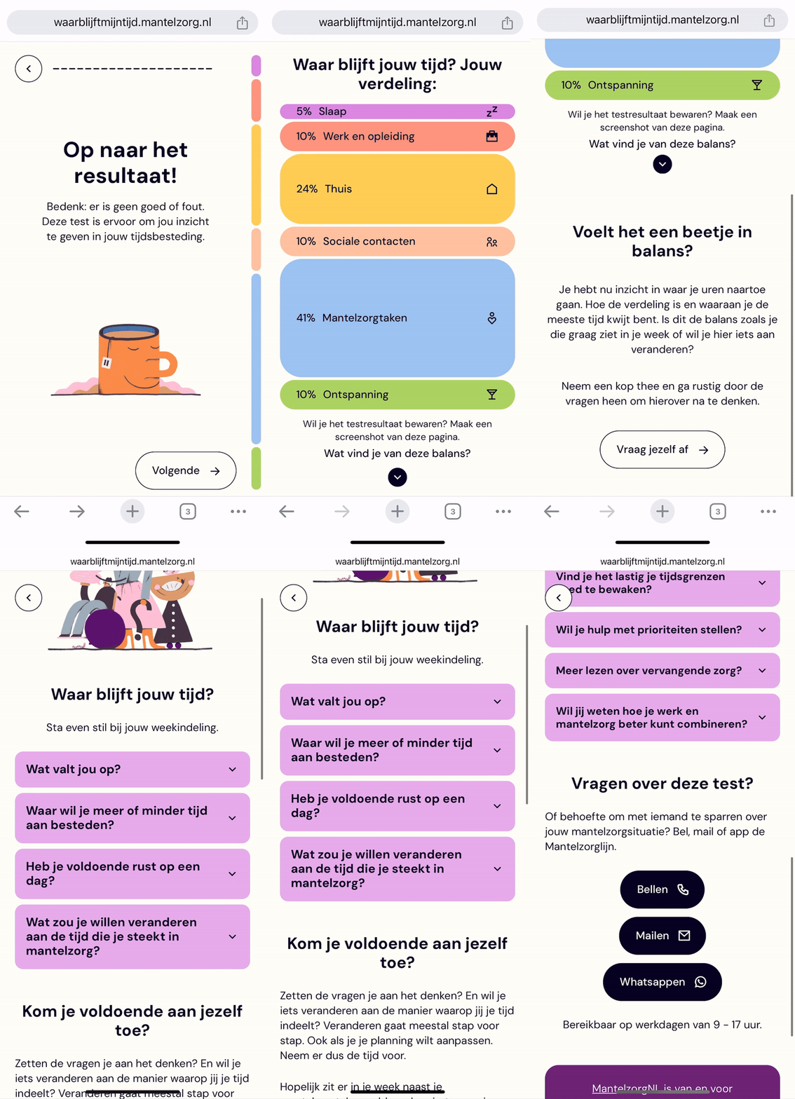
( 04 / RESULT PAGE)
On the results page, users can see the percentage of time spent on all categories. They can also click to reflect on their time allocation and learn more about how to manage their time better.
(REFLECTION)
Personal takeaways
Despite this project being compact, it required meticulous attention to numerous details, demonstrating that even small projects can demand strategic brilliance.
Transitioning from a UI in Figma to a live website presented numerous minor bugs, particularly with a text-based tool, indicating a need for more design flexibility in the design phase.
The project was initially set to be completed within two months, but client needs for tool functionality reevaluation and the request for more user reviews led to a redesign and a pause in development. This extension to a four-month timeline provided developers with extra adjustment time. It underscored the importance of managing timelines as they impact design complexity, and that pausing for thorough research can ultimately be beneficial.

Wanna Talk?
I'm always available.
(For work, what else you expect?)
@2025 Sharon Choi
